Exercise wherein I edit the first paragraph of Hemingway’s The Sun Also Rises to see how many words I can trim, and therefore claim the title for sparse prose

The Sun Also Rises entered the public domain in 2022. Published in 1926, it was Ernest Hemmingway’s first novel. Hemmingway was praised for his sparse prose, but let’s see what Grammarly thinks of the first paragraph.

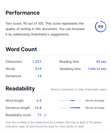
Not too bad Ernest. He received an overall score of 90. Grammarly only made ten suggestions. A couple of commas. A few re-worded sentences. Overall, there were six alerts for correctness. The passage was “Clear” and “Engaging,” and the delivery was “Just right.” The style was assessed as “All good.”

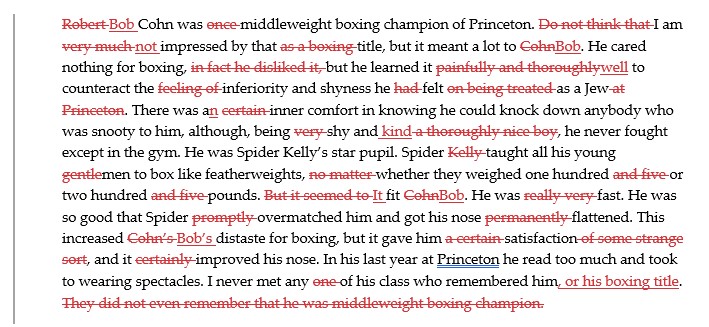
Hemmingway’s original words totaled 219, 1002 characters (without counting spaces). I thought it would be a fun exercise to revise and modernize to see if I could trim it down.

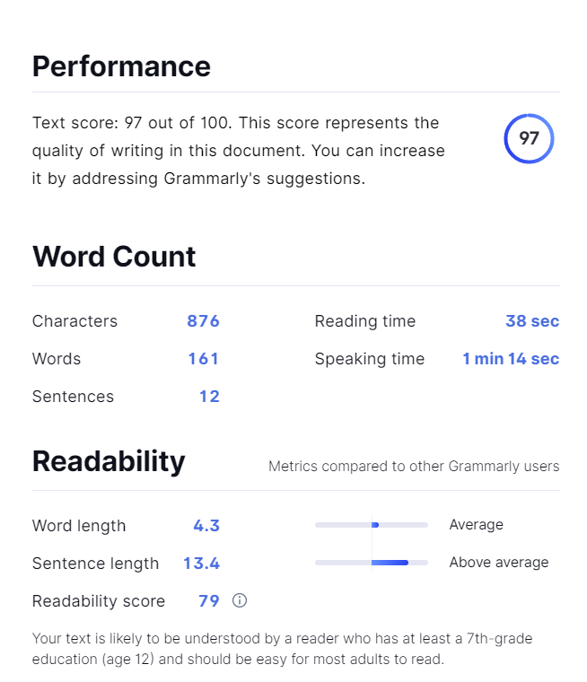
After a few passes, I cut it down to a svelte 161 words, 715 characters. Over a 25% reduction.

Bob Cohn was middleweight boxing champion of Princeton. I am not impressed by that title, but it meant a lot to Bob. He cared nothing for boxing, but he learned it well to counteract the inferiority and shyness he felt as a Jew. There was an inner comfort in knowing he could knock down anybody who was snooty to him, although, being shy and kind, he never fought except in the gym. He was Spider Kelly’s star pupil. Spider taught all his young men to box like featherweights, whether they weighed one hundred or two hundred pounds. It fit Bob. He was fast. He was so good that Spider overmatched him and got his nose flattened. This increased Bob’s distaste for boxing, but it gave him satisfaction, and it improved his nose. In his last year at Princeton, he read too much and took to wearing spectacles. I never met any of his class who remembered him or his boxing title.

But what did Grammarly think of the revision? After cutting 58 words, I boosted the score to 97 and increased the readability score by eight points. I also improved the engagement to “Very engaging.” 

Not too bad. Join me next time when I attempt to turn War and Peace into a pamphlet.

The next novel is almost real

I started writing this novel several years ago before Once in a Blue Year was even finished. I had a rough idea and a couple of scenes. I worked on it from time to time but got distracted by other projects (none of which I finished either). Over the years, the title changed, the characters changed, and the story evolved. At the beginning of the pandemic, I decided now was the time. I had always complained that if I had more time, I could finish it in a month. I had no more excuses. I dug out all the random files and started piecing them together. To my surprise, I had amassed over 500,000 words of material. The process from April until now has been chaotic, but I managed to create a viable draft. Now the hard part of revision begins. I still have a long way to go, but I am ready to give it a title: Summer of Bicycle Disasters.

Random Musings about Fountain Pens VII: New Year’s Edition

I hate new year’s resolutions. I refuse to make them. I may establish some writing or reading goals early in the year, but they are not declarations. One of my goals for 2020 is to resist the urge to buy pens that I won’t love or use. And that reminds me of the contrast between Sailor and LAMY fountains pens…

Sailor Professional Gear II v. Sailor 1911 Black Luster Full Size

I will cut right to the chase. These are two of my favorite pens. I ordered them both with custom nib grinds (left oblique for a left-handed underwriter), so it feels like cheating to compare them to other pens. I ink them with only Sailor Black. The writing experience is exquisite. They both offer distinct line variation with a slight flex to the nib. The feedback is perfect (at least for me). The only real drawback is the ink capacity. I have a few pens that rank higher with some style points, but these two are the standard to which I compare other pens. My OCD may require me to purchase new and exciting Sailor pens, but trust that I will love them and use them, and therefore, I will not fail to meet my stated 2020 goal.

LAMY 2000 v. LAMY Studio LX

I swore I would never buy another LAMY, but I broke that vow twice last year. (For the record, I have remained true to my vow to never purchase another TWSBI. Terrible pens.)

It’s been a few months since I’ve touched the LAMY 2000, but I decided to spare myself the agony of writing with that thing again. I remember the horror well-enough to describe it here; no sense re-living it. The gold, hooded nib of the 2000 inks a smooth line, but it is highly sensitive to angle and rotation. I am convinced the size and the grip were designed to irritate me. The pen will not stay still as I write. As a result, it skips. A. Lot. I tried a couple of different inks, all with the same result. The experience was closer to a dime-store felt-tip pen than it was to a gold-nib fountain pen. Save yourself a ton of money and buy a box of Paper Mates on Amazon.

The Studio LX Special Edition Black is a (slightly) better story. I inked it with LAMY Obsidian Black. The size and shape of the LX are similar to the 2000, but the medium steel nib is far superior to the gold on the 2000. It has more feedback and the pen remains stable as I write; it inks a consistent line. The LX is a better overall writing experience. The restart was a little slow after sitting a couple of days, but that is typical for pens in this price range.  I also liked the obsidian ink. LAMY earned back a couple of points after all the previous disappointments (Safari’s, I am talking about you).

All this said I am confident I will resist another LAMY purchase in 2020.

Pen Nib Filling System Capacity (ml) Weight (grams) Price (MSRP) Rating PQ
Sailor 1911 Black Luster 21kt Gold Converter 0.9 22 $392 26 $15.08
Sailor Pro Gear II 21kt Gold Converter 0.5 24 $328 25 $13.12
LAMY 2000 14kt Gold Piston 1.35 15 $219 16 $13.69
LAMY Studio LX Steel Converter 1.08 22 $149 19 $7.84

Random Musings about Fountain Pens VI

It’s been almost six months since I posted anything about pens. My collection has continued to grow over that time, so I thought I’d review a few of my recent additions. I developed a semi-scientific rating system over the last year (see table below). I rate each pen in 7 categories (nib, filling mechanism, capacity, comfort, style, cleaning, drying/startup). Some of the categories are empirical, while others are quite subjective. The highest possible score is 35. For reference, the Visconti Homo Sapiens Dark Age scored a 29 and the Monteverde Monza scored a 13. I have some pens that would score lower than the Monza, but it is not worth my time to catalog every TWSBI I have wasted money on. Speaking of money, I added a price-per-quality metric to keep everything in perspective. For reference, all the weights are unposted; I’m not a monster.

Aurora Ipsilon

This is my third Aurora fountain pen. It’s not the best of the three, but it’s the most economical. I went with the medium nib and I inked it with Noodler’s Dark Matter (my new favorite ink). After reading the descriptions, I expected more feedback on the nib. Perhaps I should have gone with the fine point to get the full experience. (side note: Italian nibs are a full step thicker than Japanese nibs; I wish there was an industry standard). The Ipsilon is small but comfortable to write with; it reminds me of the Pilot Heritage 92.

Platinum #3776

I have a few Platinum Preppies laying around. I use them in various colors for editing. This is my first upper-tier Platinum. Things started on the wrong foot. The packaging was bad, and the pen was rattling around (neither the cap nor the feed was firmly threaded). I was also irritated it did not come with a converter; I had to order one and wait a couple more days to give it a try. I eventually inked it with Mont Blanc Mystery Black. The gold nib inks a nice line, but I don’t get all the rave reviews I have read. It’s a decent pen, but it’s not a great pen.

Pineider La Grande Bellezza Stone Black

This is my first Pineider. The packaging was elegant though probably unnecessary. The pen is extravagant in design and lives up to the name. I was impressed with the magnetic locking system for the cap. I inked it with Monteverde Smoke Noir. The heft is nice, and the gold nib inks a smooth line with very little feedback. It’s almost too smooth. I tend to prefer a slight scratch to remind me I’m writing with a fountain pen. The taper of the nib is severe and makes it appear long, though it’s comparable to other pens. The narrowness of the nib makes the feed visible, not an issue, but I caught myself looking at it as I wrote, so it may prove to be a distraction for me. Time will tell. I liked the Smoke Noir ink. It was darker than I expected, a pleasant shade of gray.


Pen Nib Filling System Capacity (ml) Weight (grams) Price (MSRP) Rating PQ
Aurora Ipsilon Steel Converter 1 14 $150 20 $7.50
Platinum #3776 14kt Gold Converter 0.82 10 $240 18 $13.33
Pineider La Grande Bellezza 14kt Gold Converter 1.03 23 $498 21 $23.71

Random Musings about Fountain Pens V

Conklin All American Raven Black

I went with the medium nib and inked it with Kyo No Oto Nurebairo. I liked the feel of the pen, and the bock #6 nib did not disappoint. I had some problems with this pen being slow to restart. And then it seemed to dry completely. I bled off some air and advanced the convertor to get some ink in the nib. It wrote fine, but it was dry again the next day. I thought it was the ink, but I had the same ink in the Conklin Herringbone and that started right up after sitting for a couple days. I was sad, because I was otherwise liking the pen. I decided to clean it out with distilled water and run some Goulet pen flush through it. I re-inked with Monteverde Raven Noir. I’ve been wanting to try this ink and it seems fitting for the pen. I liked the ink. I also liked that it seemed to be flowing nicely. Perhaps that’s all that was needed to get it running well. I put it away for a couple days and it restarted immediately. I used this pen as my primary for several days and I grew fonder of it with each line I wrote. I’ve been working on a rating system for my pens and this one ranks up there with some gold nib pens that cost four or five times more. I highly recommend giving the All American a try. The features betray the price. For under $100, you can’t go wrong.


Conklin Mark Twain Crescent Filler

I am not sure why I needed this pen. I had resisted the urge to purchase it several times before, but I somehow convinced myself it was a necessary addition to my collection. I think alcohol was involved. I went with a medium nib and I inked it with Monteverde midnight black ink. I didn’t really care for the way it inked. Seemed simple enough, but I don’t have a clue how much ink actually made it into the pen. I like the overall look and feel for the pen, but the crescent is bothersome. It doesn’t inhibit writing in anyway, but it’s a visual distraction. The weight is just ok.

I was not impressed with this pen at first, but it grew on me. I used it as my primary for a couple days. It starts quick and is comfortable enough for long writing sessions. In many regards, it has the feel of the Auroras (but much less expensive). I think I still prefer Conklin’s All American, but overall, I’m glad I added this one to my collection.


Conklin Herringbone – Gun Metal

I went with the medium nib and inked it with Kyo No Oto Nurebairo. The Herringbone is noticeably heavier than the All American, but with a thinner barrel. The pen has a vintage feel and it is comfortable to write with. After writing a bit, I noticed some ink on my fingertip. At first I was worried I had a leak, but I realized that with the narrow barrel there is not much margin to the nib and I must have accidentally inked my finger. I guess that’s a draw-back, but not a major one (at least for now). I’ll have to give it some run-time to determine if it’s tolerable or not. Update: I do not like this pen at all. It might be that I have a tight grip, but my hand seems to slide toward the nib after a few minutes of writing. I get ink everywhere and it is a pain the ass. If you are on the market for a reasonably priced pen, buy anything but this one.


Pen Nib Filling System Capacity – ml Weight – grams Price (MSRP)
Conklin All American steel bock #6 Converter 1.04 18 $95
Conklin Herringbone steel bock #6 Converter 1.12 21 $70
Conklin Mark Twain Crescent Filler stainless steel Bladder/vacuum sac 2.24 18 $195

Random Musings about Fountain Pens IV

I managed to suppress my urge to purchase fountain pens for almost two whole months. I broke down the other day and bought three. Here are my initial reactions.

Sailor Pro Gear

I purchased the graphite lighthouse model. The color was lighter than I expected, but very sleek. I went with the medium 21kt gold nib. I inked it with Sailor black ink. Unposted it is a little short (and light) for my tastes. The style of the pen is simple and classic. After writing a few lines, this pen reminded me of the Pilot Heritage 92 (see review). That said, I prefer the Heritage for style, size, weight, ink capacity, and price. I will keep the Sailor in rotation to run out the ink, but overall, I am a little disappointed.

Nettuno 1911 Black Sands Ruthenium

For starters, the Nettuno packaging was cool. I went with the medium nib and inked it with Pelikan Edelstein black ink. I was almost as excited about trying the ink as I was the pen. They are both divine. The pen is on the heavy side but is nicely balanced and comfortable to write with. The ruthenium-plated #6 Bock steel nib inks a smooth line that is comparable to many gold nibs I’ve tried. The pen lives up to the package in coolness; the details are impressive. Overall, I really like this pen and will keep it in heavy rotation.

Aurora Talentum Black Ops

I went with the medium nib and inked it with Aurora black ink. If you purchase Aurora ink, be warned that the bottle contains a plastic insert that is intended to get ink all over the place; I can think of no other rational purpose for the damned thing. The Talentum is a sharp/stealthy looking pen and I love the weight. In fact, writing with this pen convinced me that 20 grams is perfect for my writing preferences. The 14kt gold nib did not disappoint. This is my second Aurora fountain pen. My first was the 88 Nera Unica (see review). The Talentum is superior in most regards. This realization surprised me when you consider the Talentum retails for about $150 less than the 88; maybe that ink window on the 88 isn’t so great in hindsight.


  Sailor Pro Gear Nettuno 1911 Aurora Talentum
Filling system Converter Converter Converter
Capacity 1 ml 1.09 ml .98 ml
Weight (body) 16.4 grams 25 grams 20 grams
Price (MSRP) $390 $395 $495

Random Musings about Fountain Pens III

It’s been a few months since my last purchase. I have been enjoying my line-up of Pilots, but I was tempted by these two. I included a summary of features at the end to show how they stack up against the Pilot 823 (my personal standard comparison).

Aurora 88 Nera Unica

I have a few Aurora rollerball pens, but this is my first Aurora fountain pen. I could not resist the black stealth of the 88 Nera Unica. I inked it with Pilot take-sumi. The piston filling mechanism was unique but very easy to use. The ink window is something that I wish every pen had. The pen is lighter than I expected, but I think I like that. The fine nib is a little thicker than I expected, but I think I like that too; it flows a smooth line and the blacked-out 14k gold is sweet. I am glad I didn’t go with a medium nib because it might have been too thick for my taste. Overall, the pen is nicely balanced and comfortable to hold. I can foresee a lot of pages being filled with this one.


Retro 51 Tornado – Stealth

I already own the Retro 51 pen/pencil set, so it was a moral obligation to add the fountain pen. I inked it with Pilot take-sumi. I’ve been spoiled by vacuum filling pens, so I wasn’t a fan of the converter; it comes with two ink cartridges that I tossed straight in the trash. The Retro has a noticeable heft compared to the Aurora even though it’s only one gram heavier. The body seems thin for a fountain pen; it is comparable to its rollerball cousin, so that makes sense. The steel nib was a turn-off at first, but it writes smooth enough that you’d swear it was gold. Overall, this pen looks great and functions well enough to be in a league with much pricier pens.


  Aurora 88 Nera Unica Retro 51 Tornado Pilot Custom 823
Filling system Piston vac Converter Piston vac
Capacity 1.36 ml 1.06 ml 2.55 ml
Weight (body) 19 grams 20 grams 19 grams
Price (MSRP) $650 $54 $360

Random Musings about Hunter Killer (and other submarine films)

I must admit up front that I have cherished every submarine movie I have ever seen. There is always some quality or aspect that allows me to overlook the technical inaccuracies or the completely implausible scenarios. Bottom line, Hunter Killer has far more qualities than inaccuracies than most submarine films I have seen. This is no doubt because the film is based on the novel co-authored by George Wallace, a retired submarine officer.
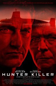
The film stars Gerard Butler as Captain Joe Glass. I’ve known quite a few submarine commanding officers, and Gerard plays the part well. The cast also includes Gary Oldman and a few other actors you may recognize. I was happy to see Toby Stephens (Captain Flint from Black Sails) in a new, yet oddly similar role as a Navy SEAL team leader. I miss Black Sails and wish it would return. If anyone from Black Sails is reading this, please make more seasons of Black Sails. But I digress.

The plot of Hunter Killer was unique and intricate. The film contained all the things you’d expect in a submarine drama: undersea warfare, depth charges, coy tactics, harrowing near death scenarios. The lack of communication between land and a submerged submarine means that a submarine commander is often forced to make critical decisions with little or no information; this builds suspense that borders on terror. Good stuff.

My only gripe with the plot was that the stuff between the Pentagon and the White House—the political aspects of military decisions—was a tad heavy-handed and probably a little over-acted at times (even though I love Gary Oldman). The backchannel operations with the NSA operative seemed implausible, but the sub-plot was entertaining nonetheless.

In my opinion, only three things were missing.

  • The order to dive was given early in the film, but the alarm was not sounded. I need to hear that alarm. I miss that alarm.
  • The obligatory emergency blow was down-played. If you blinked, you could miss it. If I ever make a submarine film, the emergency blow sequence will last about 10 minutes. It will be montage of various camera angles and crew reactions. There will be bug juice sloshing in crew’s mess and people hanging onto pipes with their feet swinging in the air. An emergency blow is a rollercoaster ride that very few people ever get to experience. I am eternally grateful to be one of those lucky people.
  • There is a great line about where to find the crew near the beginning of the film. The XO is concerned he won’t be able to round them up. The CO asks how many pubs there are near the base. The XO replies there are two. The CO says, “Let’s try something radical. I will check one, you can check the other.” It was great and realistic and quite funny, but I really wish I could have seen it. I was hoping for a montage of fights and girls and beer and debauchery. Just a couple minutes. Something. Sailors do bad things when they aren’t busy doing good things. It’s ok to tell that tale.

Despite those few missed opportunities, I really hope this film does well and ensures that Hollywood will invest in future submarine films. They average about one every 4 or five years. Since the time of my service, I’ve had the pleasure to have Hunt for Red October, Crimson Tide, U-571, The Abyss, K-19 Widow-maker, and Down Periscope. Even the latter had its moments of entertainment (I warned you, all submarine films are great in some regard).

I won’t have to wait too long for the next major theatrical release, although this one might haunt me a little more than I need. I followed the Kursk tragedy as it unfolded, and I’ve since read some non-fiction books about the events, including the failed rescue attempts. It will be gut-wrenching to put faces to these men. I will probably have nightmares for a few nights, but that is ok. It is a submarine movie and I will love it. Michael Nyqvist is also on the cast of both Hunter Killer and Kursk, so that is kinda cool for him.

Bottom line: Hunter Killer is an excellent and credible submarine drama. I will watch it again when I eventually add it to my DVD collection, but for now, it’s easily in competition for my favorite submarine drama.

Random Musings About Pilot Fountain Pens

Over the last year or so, I have acquired three standard Pilot fountain pens. I inked all three with take-sumi iroshizuku ink. Here are my reviews with a quick summary of features at the end.

Heritage 92
This was my first Pilot fountain pen. I went with the medium nib. The Heritage is only available as a demonstrator; it is clear but has black/grey accents. The pen cap and clip are more contemporary in style. The ends are squared vice rounded. I loved this pen from the moment I inked it for the first time. It is balanced and lightweight. The 14k nib inks a smooth line. The piston filling system is similar to traditional convertors and is very easy to use. The capacity is excellent.

Custom 74
I chose the black smoke model, but it is also available in blue, clear, orange, and violet. I also went with the fine nib. I wasn’t sure how I would like that, but as it turns out, I like it quite a bit. The Custom 74 has the look and feel of a classic fountain pen; from a distance, it looks like an antique, but it certainly is not. I love the silver accents (that was one reason I originally shied away from the 823). The filling system is a CON-70 which is a pump style that is quite unique and easy to use.

Custom 823
After I filled a few pages with the Custom 74, I realized my collection would not be complete without an 823. This is THE pen; it’s the workhorse that Neil Gaiman swears by. You would think his endorsement alone would be enough for me to break out the credit card, but it wasn’t. I resisted for a while, mainly because of the color selection. I prefer blacks and greys and clears. I know that seems petty and silly, but I really worried that I would not be able to write with an amber-colored pen. However, all that changed when pilot released a smoke version. The only draw-back I saw was the gold highlights. I would have preferred silver with the black theme, but oh well, I guess gold will have to do. I had a little trouble inking it for the first time; I’m still not sure why. I even broke out the instructions even though this isn’t my first vacuum filled pen. The instructions said to only use 70 ml pilot ink. I can’t imagine why that would matter. I also refuse to use blue ink, so the bottle that came with the pen was no help. After a few cycles, it finally took a little ink. On the next cycle, it filled the reservoir with ease. I suppose it just needed primed. Although it is technically a demonstrator, the body is dark, and the ink level is very difficult to discern even with a flashlight. That doesn’t really bother me, but I thought I would mention it for full disclosure. I really liked the weight of the pen, even while I was fumbling to fill it with ink. And from the moment that gold nib touched the page, I was in love. This is officially my go-to pen from now on. I am taking the Custom 74 to work; hopefully I won’t have to buy a second 823 just for the office.

Vanishing Point
Since I am writing a blog about Pilot fountain pens, I guess I would be remiss if I didn’t mention the Vanishing point. I purchased the matte black version several months ago. I wish I had purchased the 823 that much earlier. I like the concept of the vanishing point, and it is definitely a great design, but it feels awkward in my hand with the clip in the way. Everything feels upside down and I just don’t like it. I also decided to try a stub nib and I wasn’t very pleased with that either. I suppose it would be a great pen to travel with, and I thought it would be a great everyday pen at work, but I found that I was reaching for the pilot varsity disposables instead.


Heritage 92 Custom 74 Custom 823
Filling system Piston vac CON-70 Piston vac
Capacity 1.28 1.23 ml 2.55 ml
Weight (body) 12 grams 14 grams 19 grams
Price (MSRP) $275 $200 $360


As always, I buy all my pens and supplies from The Goulet Pen Company. They ship fast, and they have an excellent selection. I also highly recommend their instructional videos. I have only been using fountain pens for about two years and I learned most of what I know from Brian Goulet’s YouTube videos.

Random Musings About Fountain Pens

I recently purchased three moderately priced fountain pens from the Goulet website. Each of them was under $30. Here are my reviews:

I filled the Lamy All Black Safari with Colorverse Anti-matter ink. From the Goulet website, “The LAMY Safari is a workhorse pen, known throughout the fountain pen community for its ruggedness, reliability, and no-nonsense functionality. The triangular grip makes it great for those starting out who have no idea how to hold a fountain pen, but it’s used and loved by fountain pen lovers of all levels of experience.” Overall, I tend to disagree. This pen looks sleek, but that is where the appeal ends for me. The medium nib wrote sloppy and uneven, it felt more like a ballpoint. I was frustrated after penning just a few lines. It is light weight (too light) and feels like a pen the waitress at Denny’s handed me to sign for the bill. The packaging is just a little better than a Bic pen you can buy at Walgreens. In my opinion, it is an inadequate fountain pen experience.

I filled the Nemosine Singularity with Diamine Onyx Black ink. The Nemosine packaging is quite nice for a pen at this price. I have seen lessor packaging with significantly more expensive pens. Per the Goulet website, the “Nemosine Singularity fountain pen features a clear translucent demonstrator resin body and cap with black trim. It has a lightweight plastic body and grip, a threaded screw cap which pushes to post, and a silver iridium-tipped German made #6 steel nib.” I purchased this one with the extra-fine nib. I tend to prefer a medium nib; however, I’ve become a little frustrated with absorption and bleed-through on cheap paper (especially at work where they buy the cheapest paper imaginable). The extra-fine nib will certainly help me overcome this frustration. The pen writes very smooth. It is lightweight and stylish. I generally lean toward demonstrator pens, but this one genuinely provided a nice fountain pen experience.

I filled the Monteverde Monza with Monteverde Moonstone ink. From the Goulet website, “This Monteverde Monza fountain pen features a translucent clear resin body with chrome accents and a #5 steel nib. Best of all, this pen comes with three different nibs – fine, medium, and omniflex – each with their own nib unit, grip, and converter for ease of swapping.” I used the flex nib to start, because I had never used a flex and I was curious. It wrote smooth, but I didn’t get the line variations I had expected. Perhaps I just need more practice. The multiple tips are definitely an appeal if you want to try different things and don’t want to maintain multiple pens. Of course, I already have multiple pens and that is part of the fun. All that said, I wasn’t very impressed with the Monza or the omniflex nib.

All three of these pens are decent entry-level fountain pens. Of the three, I would definitely recommend the Nemosine Singularity. It is sleek and stylish. It is also comparable to the Pilot Heritage 92 but at a fraction of the price. If you are willing to go without a gold nib, then you can’t go wrong.

1 2 3 7